Customizing the appearance of UISegmentedControl
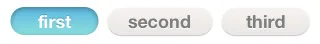
You are probably familiar with the UISegmentedControl and its default look which is found in many native iOS apps:
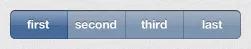
This UI control can be created using the UISegmentedControl Class, available in the UIKit framework. The appearance of this control can be easily customized, yet how to do that is not always apparent to new iOS developers. I was recently asked to create a row of separate buttons that would behave similarly to UISegmentedControl. That is, only one button could be selected at any given time. The design looked something like this (specifically this one I took from dribbble):
Generally speaking, the appearance of the UISegmentedControl could be customized by using the following methods that set the background and divider images:
- (void)setBackgroundImage:(UIImage *)backgroundImage
forState:(UIControlState)state
barMetrics:(UIBarMetrics)barMetrics;
- (void)setDividerImage:(UIImage *)dividerImage
forLeftSegmentState:(UIControlState)leftState
rightSegmentState:(UIControlState)rightState
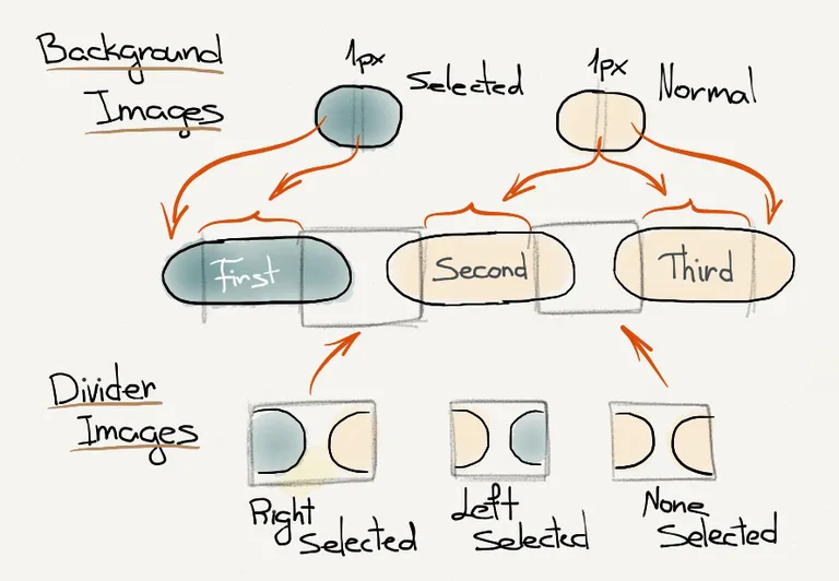
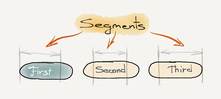
barMetrics:(UIBarMetrics)barMetrics;The background image fills the stretchable parts of the control segments and their edges. Therefore, this image should have equal-sized left and right parts used for the left and right edges of the control, respectively. These two parts must be separated by a 1-pixel wide line (2 pixels for retina images). This line is used to fill the control segments by stretching itself horizontally. The divider images are used to fill the space between the control segments. These images are used “as is” without being stretched, and therefore their width defines the space between the control segments. The following diagram shows how these images are used in UISegmentedControl:
After we know how UISegmentedControl uses these images to present itself, we can write some code to customize its appearance. In the following example, I have created a subclass of UISegmentedControl called MySegmentedControl, which has all the needed code to customize the appearance of our control. By the way, subclassing is not required, and everything that is shown here could be done by sending those same messages (an Apple’s terminology for “method invocation”) to an instance of the UISegmentedControl class.
First, we need to create all five images: two background images for the selected and normal (unselected) states and three divider images. The three divider images are used for:
- The left and right edges of the adjacent unselected segments
- The left edge of the unselected segment and the right edge of the adjacent selected segment
- The left edge of the selected segment and the right edge of the adjacent unselected segment
- mySegCtrl-selected-bkgd.png
- mySegCtrl-normal-bkgd.png
- mySegCtrl-divider-none-selected.png
- mySegCtrl-divider-right-selected.png
- mySegCtrl-divider-left-selected.png


Then we need to create a subclass of UISegmentedControl, by creating a header and an implementation file:
#import <UIKit/UIKit.h>

@interface MySegmentedControl : UISegmentedControl
@end
In the implementation file for MySegmentedControl we will override the designated initializer - (id)initWithItems:(NSArray *)items and call the appearance methods:
#import "MySegmentedControl.h"
@implementation MySegmentedControl
- (id)initWithItems:(NSArray *)items {
self = [super initWithItems:items];
if (self) {
// Initialization code
// Set divider images
[self setDividerImage:[UIImage imageNamed:@"mySegCtrl-divider-none-selected.png"]
forLeftSegmentState:UIControlStateNormal
rightSegmentState:UIControlStateNormal
barMetrics:UIBarMetricsDefault];
[self setDividerImage:[UIImage imageNamed:@"mySegCtrl-divider-left-selected.png"]
forLeftSegmentState:UIControlStateSelected
rightSegmentState:UIControlStateNormal
barMetrics:UIBarMetricsDefault];
[self setDividerImage:[UIImage imageNamed:@"mySegCtrl-divider-right-selected.png"]
forLeftSegmentState:UIControlStateNormal
rightSegmentState:UIControlStateSelected
barMetrics:UIBarMetricsDefault];
// Set background images
UIImage *normalBackgroundImage = [UIImage imageNamed:@"mySegCtrl-normal-bkgd.png"];
[self setBackgroundImage:normalBackgroundImage
forState:UIControlStateNormal
barMetrics:UIBarMetricsDefault];
UIImage *selectedBackgroundImage = [UIImage imageNamed:@"mySegCtrl-selected-bkgd.png"];
[self setBackgroundImage:selectedBackgroundImage
forState:UIControlStateSelected
barMetrics:UIBarMetricsDefault];
}
return self;
}
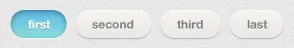
@endWe are not finished just yet – if we embed the code above in a UIViewController we will see that the text inside the control’s segments is not aligned properly. The following code will produce undesired results:
NSArray *items = @[@"first", @"second", @"third"];
MySegmentedControl *mySegmentedControl = [[MySegmentedControl alloc] initWithItems:items];
mySegmentedControl.frame = CGRectMake(10, 7, self.view.frame.size.width - 20, mySegmentedControl.frame.size.height);
mySegmentedControl.selectedSegmentIndex = 0;
[self.view addSubview:mySegmentedControl];
And the result:
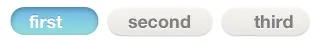
So why is this happening? Well, the answer is hidden in the implementation of UISegmentedControl. What happens is that UISegmentedControl center-aligns text inside its segments according to their width, but the segment’s width doesn’t include the divider images. Here’s a diagram to clarify things:
To solve this issue we need to adjust the content position of the first and last segments by 1/2 the width of the divider images, assuming that all divider images have the same width. To do this we need to add two lines of code to MySegmentedControl:
[self setContentPositionAdjustment:UIOffsetMake(dividerImageWidth / 2, 0)
      forSegmentType:UISegmentedControlSegmentLeft
      barMetrics:UIBarMetricsDefault];
[self setContentPositionAdjustment:UIOffsetMake(- dividerImageWidth / 2, 0)
      forSegmentType:UISegmentedControlSegmentRight
      barMetrics:UIBarMetricsDefault];
And with that we reach our final result: